Tuesday, 31 March 2009
Monday, 23 March 2009
Friday, 20 March 2009

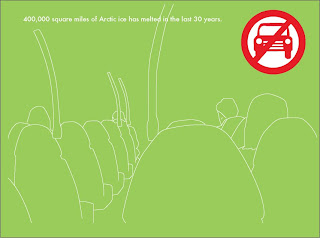
The above and below images are a couple of our final solutions to how to make people use public transport more. We targeted car drivers and used global warming as our facts to try make them use public transport more. Using facts on how our world is changing because of global warming and imagery we hope that our posters will help make car drivers use public transport which in the long run would mean less car emissions going into the atmosphere, which is a factor for global warming. One problem we found was keeping to two colours then stock which was a restraint on the brief. It meant designing simple imagery, considering the colour and how we could use the stock effectively. I think we did this well, we used the green as the promoter of using public transport which is why the bus in the imagery is green then the car in the logo is coloured red. More research could of been done for this brief to back up our ideas more, also more photographs to work with would have been better and we should have experimented with more layouts and colour.

Last brief was to create a way of showing how to choose a university. To begin with i find posters and leaflets that are targeted at students since my target audience would also be students. The research i found was very bright, illustrative and intense so to begin with i took on this approach and tried to design something intense and illustrative. However this didnt work out, it wasn't appropriate to the context of the poster and simply blended in with every other poster seen in student common rooms, cafes etc. I need a new angle and decided to title my work how to find a university. Changing choose to find allowed me design a poster based on a map. As you can see above my poster is a map with the street names being the things to consider when choosing a university. I should have put colour into my work it would have made the work more visually interesting and i could have used colour to highlight the roads the viewer should be looking at. I probably should have left the other street names out because it takes the viewers eyes away from the roads i wish them to be looking at. All in all i tried to keep my idea simple and straight to the point in the end and i think i achieved this.
Tuesday, 17 March 2009
Friday, 13 March 2009
The first 2 videos below were my first experiments simply trying out stock animation since ive never done it before as you can probably tell. The stick man video is poor, he doesn't really look like hes walking, the animation needs a lot more pictures to make it flow, i should have done more drawings for it.
The very simple line drawing works a lot better, flowing quite nicely.
I wanted to start experimenting with lego to make building blocks. When we see a city landscape the landscape has depth by the Buildings closer being bigger so i've started to play around with this using lego. I'm defo going to take this further and play around some more.
Wednesday, 11 March 2009
Tuesday, 10 March 2009
Thursday, 5 March 2009
Blog Archive
-
▼
2009
(72)
-
▼
March
(26)
- No title
- Im happy with this video, i think it flows better ...
- The above and below images are a couple of our fin...
- No title
- Last brief was to create a way of showing how to c...
- Rather then just playing with blocks at random, im...
- Nice quick animation i found similar to mine in th...
- No title
- No title
- The first 2 videos below were my first experiments...
- No title
- No title
- No title
- Think im going give animation a go with lego hopef...
- really sorry none of my own animation have been po...
- really like the work below, like the illustrations...
- No title
- No title
- No title
- Problem with the images with people in them are th...
- No title
- No title
- No title
- Latest brief is a live competition, making a postc...
- Thought the piece of work below is fantastic, not ...
- No title
-
▼
March
(26)
