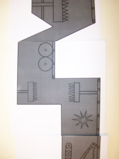
 Another visual language class where we were communicating message visually.
Thursday, 20 November 2008
 Here we had to have a series of 10 images hat communicated a colour. I don't think i answered the brief well at all but i do like my idea which was a world with chickens running it. Rather then Mcchicken burgers at Mcdonalds it would be Mchuman burgers, my series of 10 show the manufacture of these burgers.
 In visual language we had to play with line shape and letterform to communicate simple words. We didnt have much time to do this but it was a good exercise making us think and keep things simple.
Monday, 10 November 2008
Subscribe to:
Comments (Atom)


